

Design Concept:
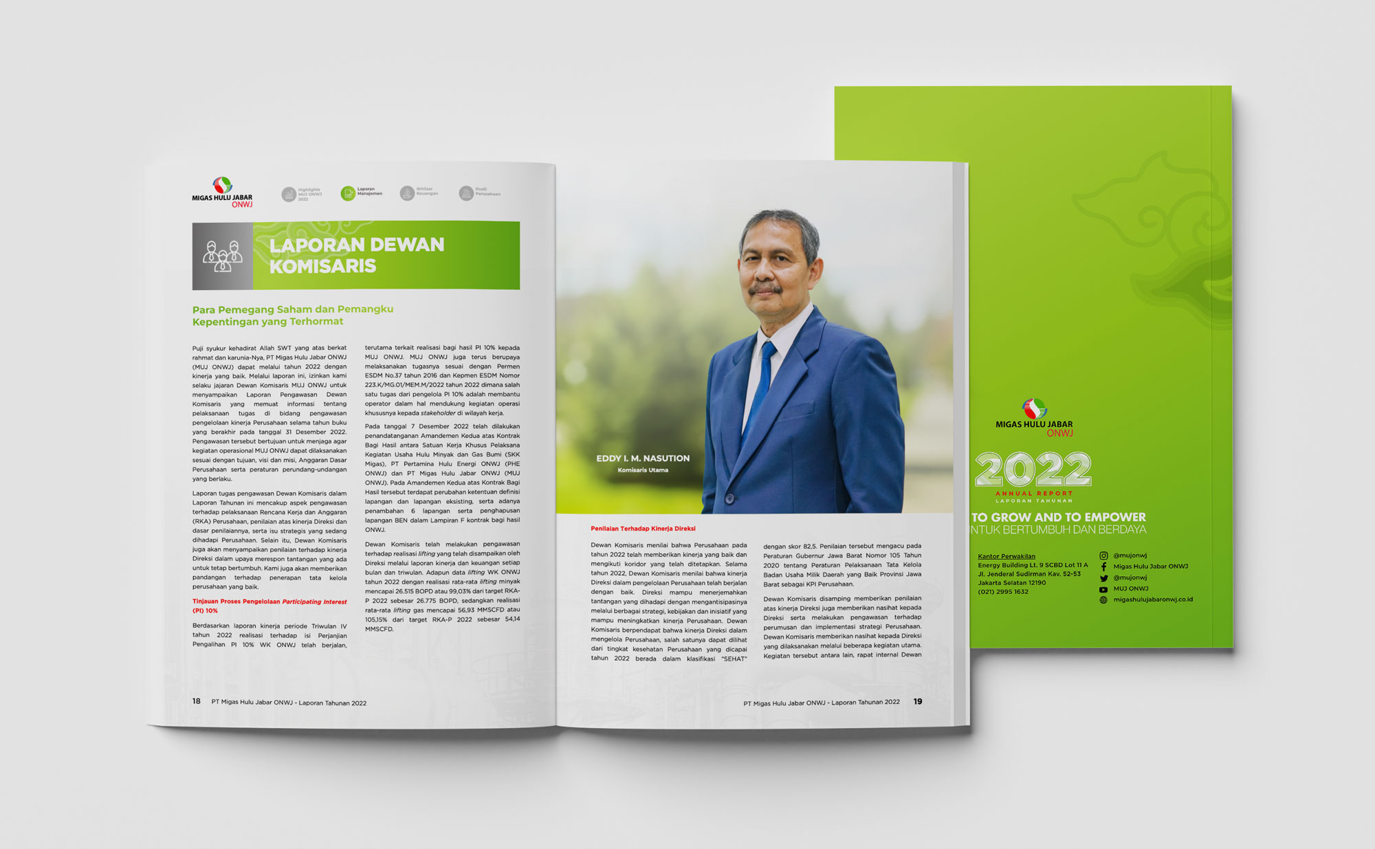
The design of this annual report reflects the essence of Migas Utama Jabar – elegant, sophisticated, and informative. Every element of the layout has been meticulously crafted to ensure clarity, coherence, and aesthetic appeal. Through a harmonious blend of typography, color palettes, and imagery, we aim to present complex data in a visually engaging manner, making it accessible and easy to comprehend for all stakeholders.
Key Features:
Elegant Layout: The layout exudes sophistication, with clean lines, ample white space, and a balanced composition that enhances readability and visual appeal.
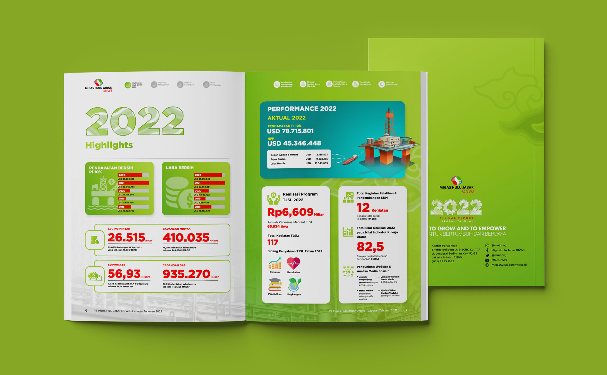
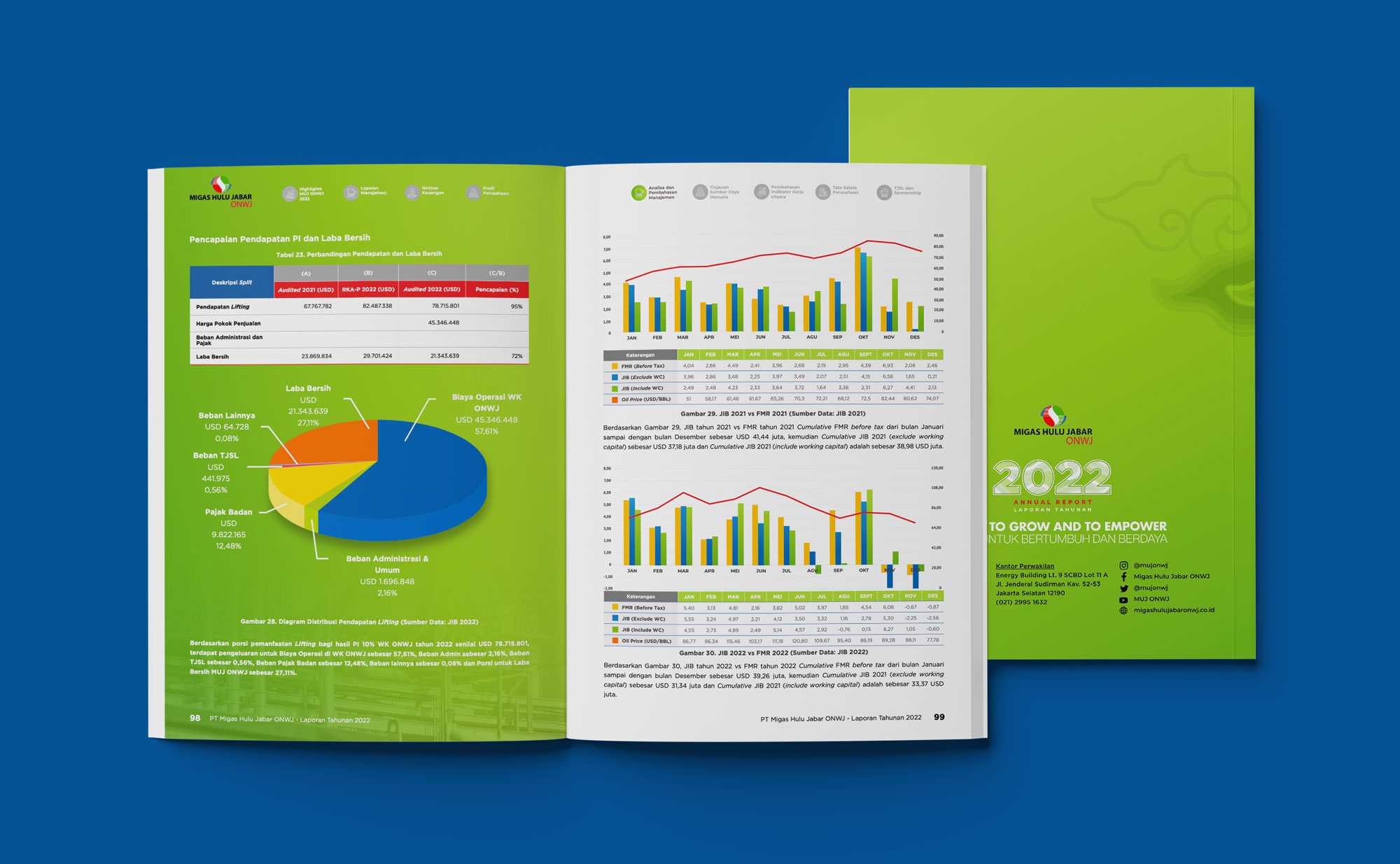
Financial Highlights: A dedicated section highlights key financial metrics, charts, and graphs that illustrate Migas Utama Jabar’s remarkable growth trajectory, even amidst global uncertainties.
Comprehensive Charts: Complex financial data is presented through clear and concise charts, ensuring ease of understanding for every reader.
Innovative Infographics: Engaging infographics provide insightful snapshots of key performance indicators, allowing stakeholders to grasp essential information at a glance.
Accessible Language: The use of simple and concise language ensures that even complex concepts are easily digestible for readers from diverse backgrounds.
Visual Cohesion: A consistent visual identity runs throughout the report, reinforcing brand recognition and creating a cohesive reading experience.
User-Friendly Format: The report is designed to be user-friendly, with intuitive navigation and a logical flow of information, facilitating ease of use for all stakeholders.

Typography
We use clean, legible fonts and maintain a consistent typeface throughout the report. Montserrat, in particular, is chosen for its readability, recognizability, and aesthetic appeal.
Spacing
We effectively utilize white space to avoid clutter and make the content more digestible, ensuring a pleasant reading experience.
Alignment
We ensure that text and images are properly aligned to create a neat and organized appearance.

Color Scheme
We select a cohesive color scheme that aligns with MUJ OWNJ’s brand identity, enhancing the overall visual experience.
Imagery
We incorporate high-quality images, illustrations, and icons that are relevant and add significant value to the content.

Charts and Graphs
We utilize well-designed charts, graphs, and infographics to present data clearly, making complex information easily understandable.
Highlight Key Data
We emphasize important figures and statistics through visual elements such as bold fonts and contrasting colors, ensuring they stand out.

Print Quality
For physical reports, we guarantee high-quality printing with sharp images and crisp text. We employ special finishes such as embossing, foiling, or spot UV to enhance the report’s impact.
Paper Choice
We select 150gsm Premium Art Paper for this report, providing a premium tactile experience.